In the Print on Demand (POD) industry, understanding color is critical. A t-shirt design that looks vibrant and stunning on screen can print with color shifts, washed-out tones, or results that don’t meet expectations leaving customers disappointed and directly affecting both sales and brand reputation.
One of the most common causes lies in the color mode you use: RGB and CMYK. So, what are RGB and CMYK? How do they differ, and how do they impact POD print quality? This article takes a detailed look and provides practical guidance that POD sellers can apply to their businesses.
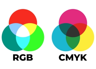
What is RGB?
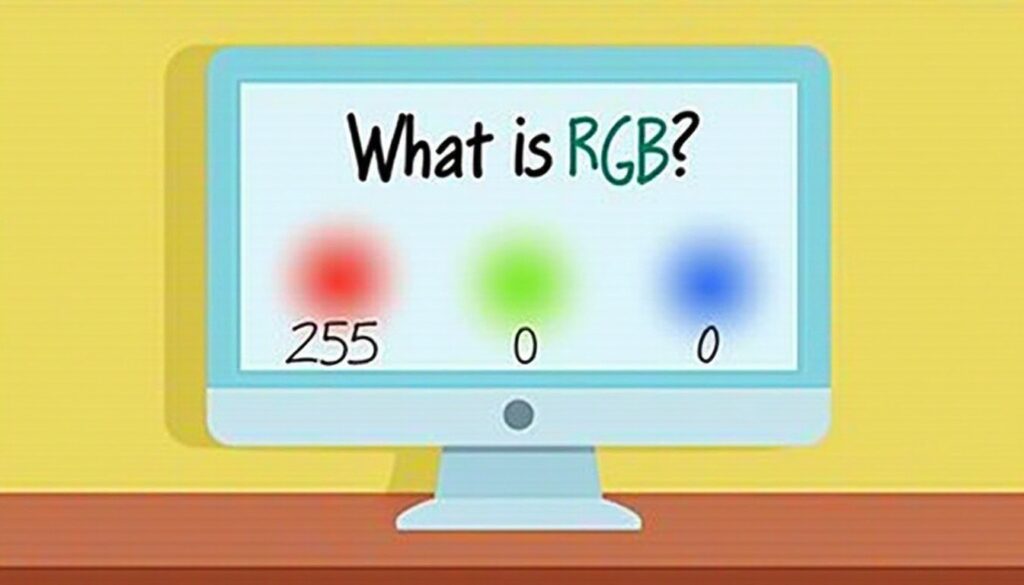
RGB stands for Red, Green, and Blue. It is an additive color model that works based on the principle of emitting light.
Imagine you are in a completely dark room.
- If you shine a red flashlight, you will see red light.
- If you then shine a green flashlight, the overlapping area will appear brighter and create yellow light.
- When you shine red, green, and blue lights together at full intensity on the same spot, you will see pure white light.
- Conversely, when there is no light at all (all three colors are at 0 intensity), you get black.
How RGB Works:
- Mechanism: Combining light sources to create colors.
- Color Gamut: Very wide, capable of displaying millions of vibrant, vivid colors.
- Primary Applications:
- Digital display devices such as computer monitors, smartphones, TVs, and digital cameras.
- Online advertisements, website banners, and social media graphics.
In essence, anything you see on a screen is displayed using the RGB color model. This explains why your designs look so bright and vibrant when viewed on electronic devices.
What is CMYK?
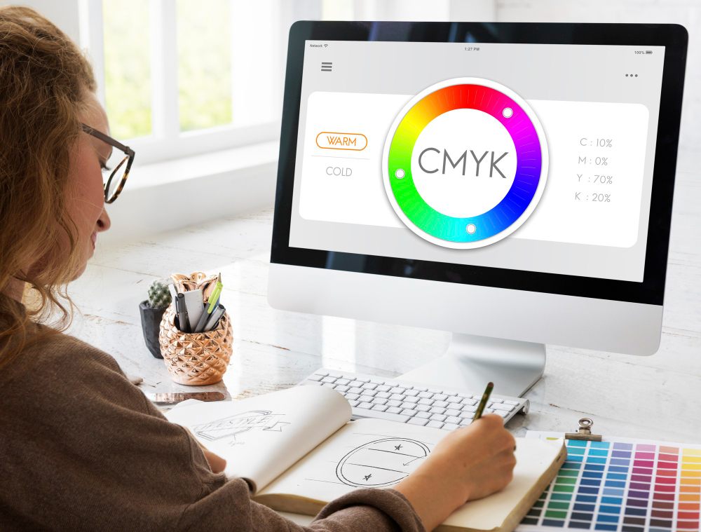
CMYK stands for Cyan, Magenta, Yellow, and Key. In this context, “Key” refers to black, which is used as the primary color to increase contrast and depth, while also saving ink instead of mixing the other three colors to create dark tones. CMYK is known as a subtractive color model.
Unlike RGB, CMYK works by subtracting (absorbing) light. Imagine printing on a sheet of white paper:
- White paper reflects all light.
- When you print a layer of cyan ink, it absorbs red light and only reflects green and blue light back to your eyes.
- Similarly, magenta ink absorbs green light, and yellow ink absorbs blue light.
- By combining (layering) these inks in different ratios, a wide range of colors can be produced.
In theory, mixing cyan, magenta, and yellow together should create black. However, in reality, this mixture results in a dark brown color. This is why black ink (Key) is added to produce a true, deep black.
Key Characteristics of CMYK:
- Mechanism: Subtracting light from a white surface to create colors.
- Color Gamut: Narrower than RGB. CMYK cannot reproduce all bright, vivid colors, especially neon shades, as well as intense greens and blues that you see on digital screens.
- Primary Applications:
- All physical printing products, such as books, magazines, business cards, and posters.
- Most importantly, POD products like t-shirts, mugs, tote bags, and more.
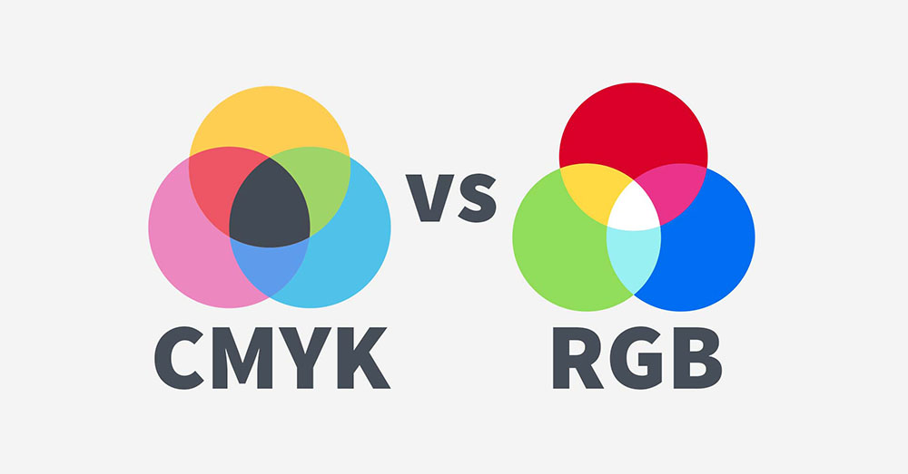
Comparing RGB and CMYK in POD
In Print on Demand (POD), understanding the differences between RGB and CMYK is key to ensuring product quality. The table below provides a clear side-by-side comparison:
| Factor | RGB (Screen Display) | CMYK (Printing) |
| Full Name | Red – Green – Blue | Cyan – Magenta – Yellow – Black |
| Operating Principle | Additive Color Model | Subtractive Color Model |
| Color Range (Gamut) | Wide, capable of displaying millions of vibrant colors | Narrower, some colors cannot be reproduced |
| Primary Use | Digital designs, on-screen visuals | Printing physical products |
| White Color | Combination of all three colors at maximum intensity | No ink applied, white paper shows through |
| Black Color | Absence of light | Combination of all four inks |
| Printing Accuracy | Not accurate for printing | Accurate and true to real-life colors |
The core difference between RGB and CMYK lies in their color gamut, or the range of colors each system can represent. The RGB color space is significantly larger than CMYK. This means that many vibrant, vivid colors you create in RGB on your computer screen are completely outside the reproducible range of a printer using CMYK inks.
This is the root cause of most color issues in the POD industry. When you send a design file in RGB to a POD provider, their printing system—which operates in CMYK—must automatically convert the colors. During this conversion, any colors that fall outside the CMYK range will be replaced with the closest possible match.
The result?
- Duller, less vibrant colors: Bright blues, greens, oranges, and pinks that pop on screen will look darker and more muted when printed.
- Unexpected color shifts:
- A vibrant lime green may turn into an olive green.
- A neon pink might become a pale, dusty pink.
This not only affects the visual appeal of your product but can also lead to customer disappointment, resulting in negative reviews, refund requests, and ultimately harming your store’s reputation and revenue.
When to Use RGB and When to Use CMYK in POD
Knowing when to use RGB and CMYK is crucial to ensure your POD products look just as amazing in real life as they do in your designs. However, in today’s modern POD industry, the answer may surprise you. The rule is no longer as simple as “design in RGB, print in CMYK.”
When to Use RGB
For most POD sellers, the RGB color mode (specifically the sRGB color space) should be your go-to choice throughout the entire process from the initial concept to uploading your final design files to your POD provider’s platform.
RGB is the optimal choice in these scenarios:
- Design and creativity: Leverage RGB’s wide color range to create vibrant, eye-catching designs with neon effects, bright gradients, and intricate details that really pop on screen.
- Digital display: Perfect for creating advertising banners, social media posts, and especially product mockups for platforms like Etsy, Amazon, and TikTok Shop. These visuals are always displayed in RGB, ensuring they look sharp and appealing to potential customers.
- Preparing print files for upload: This is the most important point. Most leading POD providers require you to upload files in RGB format. Their systems use specialized RIP (Raster Image Processor) software to convert colors from RGB to CMYK in the most optimized way for their specific printers, inks, and materials. This ensures the final printed product is as accurate as possible without you needing to manually manage the conversion process.
When to Use CMYK
You only need to work with CMYK color mode in two specific situations:
- When your POD provider explicitly requires it: Some providers or certain printing processes-such as offset printing for bulk orders-may request files in CMYK format. Always carefully review your provider’s design guidelines to ensure your files meet their exact specifications.
- For color checking (Soft Proofing): Use your design software’s CMYK preview mode (e.g., in Photoshop or Affinity Designer) to simulate how your colors will shift when printed. This helps you identify vibrant RGB colors that may become muted or dull when converted to CMYK and make adjustments to your design accordingly.
- Important note: This is only for checking purposes. The final file you upload to your POD provider should still be saved in RGB format unless otherwise specified.
Important Tips to Help POD Sellers Avoid Color Mismatch Issues

Turning your carefully crafted design into a high-quality POD product requires minimizing color mismatch errors. Below are key tips every POD seller should keep in mind to optimize print quality and ensure customer satisfaction.
- Always Order Samples – The Unbreakable Rule: This is the most important real-world testing step that you should never skip. Even a perfectly color-calibrated screen can never reflect 100% accurately how colors will appear when printed on different materials such as fabric, ceramics, or plastic. Ordering samples allows you to see the print quality firsthand, evaluate color accuracy, and make necessary adjustments before moving into mass production.
- Design Smart and Safe: Take a proactive approach to minimize risks right from the design stage.
- Check mockups on multiple background colors: A vibrant design on a white shirt may appear dull or inaccurate on a black shirt. Always test your design on mockups with light backgrounds (white, pastel), dark backgrounds (black, navy), and neutral backgrounds (gray) to ensure it works well across different product colors.
- Avoid out-of-gamut colors: Neon shades and overly vibrant blues and greens in the RGB color space are very difficult to reproduce accurately in print. Prioritize safer color ranges or use the Soft Proof tool to preview how the final printed result will look.
- Choose a Reliable Fulfillment Provider: Print quality largely depends on your production partner. A professional provider like FlashShip can be a powerful ally by offering:
- Expert consultation and design file checks before printing.
- Printing equipment and inks that are regularly color-calibrated for accuracy.
- Sample products at reasonable costs to test quality before mass production.
- Manage Design Files Professionally: Instead of separating files into RGB and CMYK versions, maintain a single master file in sRGB format with high resolution (300 DPI). This file is your most valuable asset, used both for uploading to your fulfillment provider and for future edits. Keeping the file in sRGB ensures maximum compatibility with the workflows of most modern POD print facilities.
Understanding and correctly applying the differences between RGB and CMYK is not just technical knowledge it is a critical foundation for ensuring your POD products meet high-quality standards and delight your customers.
By mastering color principles, thoroughly checking designs before printing, and partnering with trusted providers like FlashShip, you are laying a solid foundation for the long-term success of your POD business.
Remember, the ultimate goal is not just to create a stunning design on screen, but to deliver a professional, color-accurate, and durable final product that exceeds customer expectations.
Leave a Reply